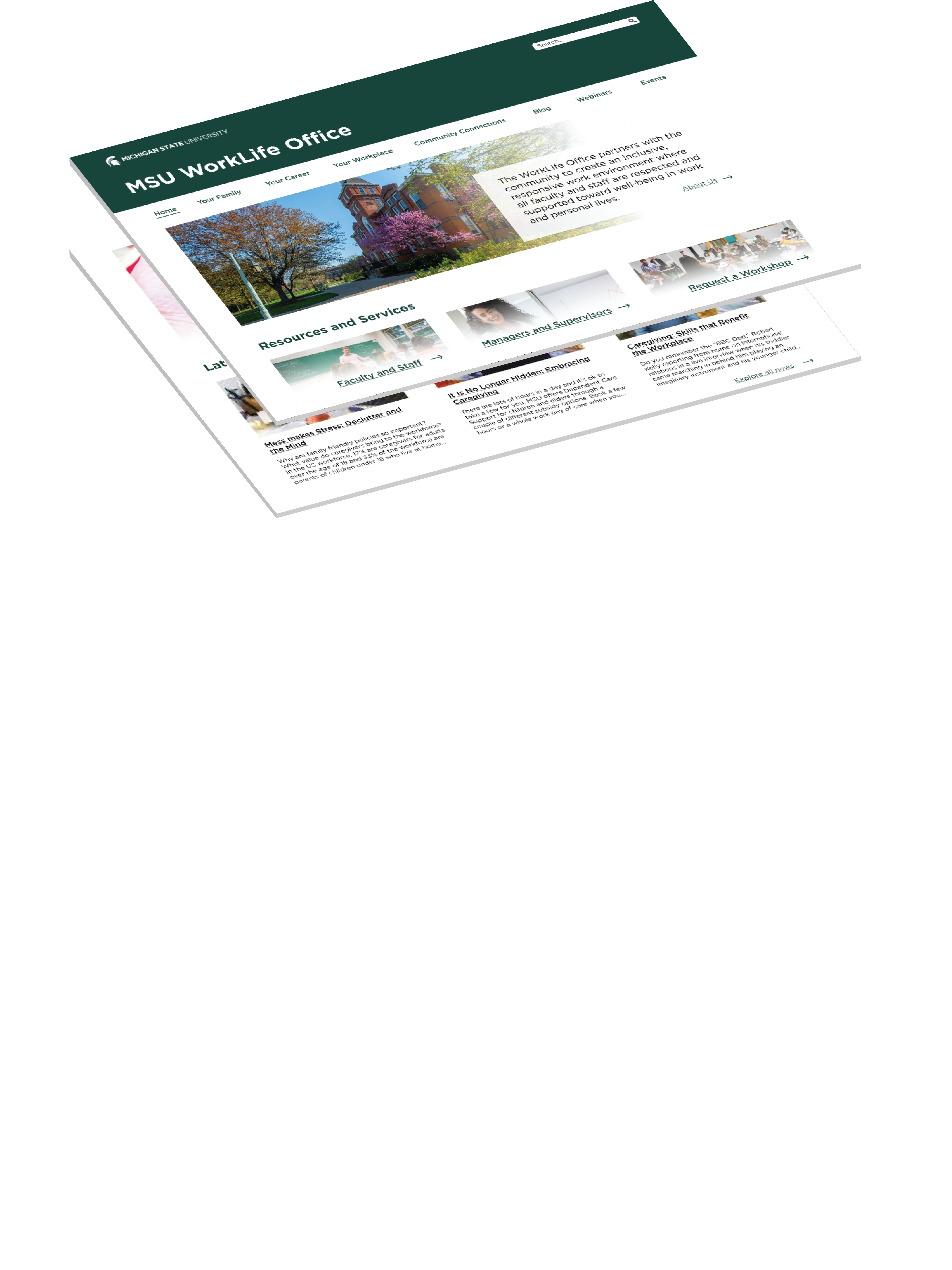
worklife.msu.edu website design concept

MSU Worklife Office

Usability/Accessibility audit and user interface design

sUMMARY
My goal was to audit the current worklife.msu.edu website for usability and accessibility issues and provide recommendations to improve the overall website experience. Suggestions from this report have now been implemented to help both internal and external visitors to streamline the process of locating information, understanding purpose, and remove accessibility barriers.
PROJECT DESCRIPTION
Client
Michigan State University
Role
Lead Designer
Contribution
Information Architecture
User Interface
Accessibility Audit
Experience and Functionality Optimization
Project Management
Background
The Michigan State University WorkLife Office had become difficult to navigate for many, including internal employees. The Office of the Provost sought help from a small team of user experience professionals for a variety of UX-related problems, focusing on accessibilty and usability optimization.
Screenshot from Accessibility Audit
an example from the accessibility findings report
Accessibility and Usability Audit
The first step was to conduct an accessibility audit to ensure compliance with Web Contant Accessibility Standards (WCAG). At this time, the team and I audited the website for opportunities to optomize the experience and functionality. Using the audit results the team created a presentation including recommendations for the WorkLife team.
Results and feedback
The WorkLife Office purpose is unclear to users on the homepage
The purpose of the MSU WorkLife Office is not clear upon immediate entry to the website causing confusion for users.
The homepage is cluttered and overwhelming to users
With the abundance of information being shared on the WorkLife Office website clear organization and hierarchy are necessary to ensure users can quickly understand the intended purpose of all content, and to be able to navigate efficiantly.
Text-heavy pages with few visual elements
Content pages are overwhelmed with text; lacking visual elements that would support the comprehnsion of the information.
An abundance of accessibility issues
ARIA roles are misused or missing, alt text is inconsistently used, and tab order is not intuitive.
User Interface Design
I then created a mock-up design for the worklife.msu.edu homepage aimed to combat these issues. While following MSU brand standards, I created an interface that brings attention to important information for the users. I chose design elements and images specifically to project the friendly, people-focused energy that the WorkLife Office encompasses.
worklife.msu.edu website design concept
Mock-up for the homepage of the worklife.msu.edu
*This is an ongoing website redesign project. At this time, the WorkLife Office has not yet moved forward with the development of a new website.